|
|
Post by Barry SR Gowing on Nov 17, 2009 8:07:55 GMT
Is there a more outrageous "bondage pic" than the one that has been posted? This is not a cigar...  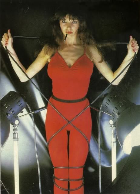 The pictures were taken during a promotional visit to Holland, so I assume the Dutch photographer must have been Govert de Roos. The dresses are by Dutch designer Fong Leng. OK ... I thought there was one that was a little more "confrontational"! Still, it's more the look on Kate's face that makes this disturbing! Plus the lighting is a bit unflattering and harsh - it does make her look a little "cheap", I suppose. It's actually quite clever how she is wrapped in the power cords from the lights. Overall, this photo makes her look distinctly unfriendly; mad, bad and dangerous to know. The family probably wouldn't have liked this pose even without the bondage connotations. Compare this to almost any other picture of her ... usually she's either smiling, sultry (the Kate "come hither" look), or staring levelly at the camera with a neutral expression. The exception to the rule would be something like "Babooshka" - where she does look fairly menacing once she's transformed from tired wife to temptress. 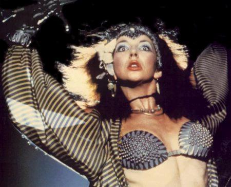  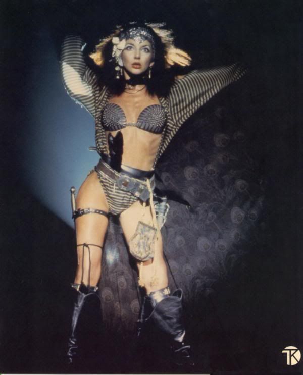 The lighting is a bit softer for "Babooshka" so the effect is not quite as harsh. --Paul-- |
|
|
|
Post by tannis on Nov 17, 2009 11:27:46 GMT
Yes, Paul, Kate's face does look pretty disturbed, and she and her family probably wouldn't have liked this pose anyway. But, as you say, it is clever how she is wrapped in the power cords from the lights... camera... action... 
 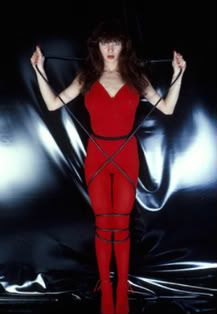 "mad, bad and dangerous to know..." "mad, bad and dangerous to know..."
The lighting in the 'cigar smoking' photo disturbs Kate's face, and seems changed in the more beautified Record Mirror version. There is also speculation that the cigarette is a photoshopped addition. And, looking closely at the lips, I agree that it does look like an add-on. But that is definitely BaBushKaTe's chest! 
|
|
|
|
Post by Barry SR Gowing on Nov 17, 2009 23:10:08 GMT
= The lighting in the 'cigar smoking' photo disturbs Kate's face, and seems changed in the more beautified Record Mirror version. There is also speculation that the cigarette is a photoshopped addition. And, looking closely at the lips, I agree that it does look like an add-on. But that is definitely BaBushKaTe's chest! [/color]  [/quote] The smoking photo has different lighting partly because there are two bright lights positioned under her at either side. That definitely gives an odd effect. The jury is out on the cigar - it would have been tricky to put that in back then - easy in 2009, tricky in 1978. She certainly did smoke back in those days, so I wouldn't put it past her. As for BaBushKaTe's chest - I can't help but notice the difference between her ... how can I put this? Size. From the early pics to almost everything later on. Compare the pics of her in 1978 (for example, the Mankowitz photos) to something like the Babooshka video, where she is wearing a kind of dimpled bra, where nothing much is hidden. There is an obvious difference in size. I'm surprised that no one has ever noticed this before. --Paul-- |
|
|
|
Post by tannis on Nov 18, 2009 3:27:09 GMT
As for BaBushKaTe's chest - I can't help but notice the difference between her ... how can I put this? Size. From the early pics to almost everything later on. Compare the pics of her in 1978 (for example, the Mankowitz photos) to something like the Babooshka video, where she is wearing a kind of dimpled bra, where nothing much is hidden. There is an obvious difference in size. I'm surprised that no one has ever noticed this before.
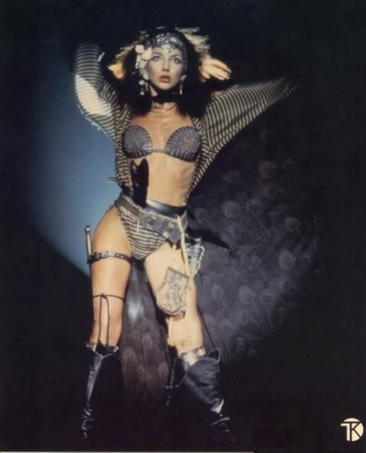    Swordsmistress of Chaos (1978) Swordsmistress of Chaos (1978)
The Babooshka look was of course taken from the work of Chris Achilleos, a painter and illustrator who specializes in fantasy artwork and glamour illustration. Chris Achilleos painted the covers for Richard Kirk's Raven series [BTW, Raven Bush is the name of JCB's son, the nephew of the one and only Kate Bush]. Recently, his work has also included fetish art.
And regarding the peacock cape: when a finalist performed 'Babooshka' on Stars In Their Eyes in the UK, KaTe gave her the original cape she wore in the video! |
|
|
|
Post by Barry SR Gowing on Nov 18, 2009 15:16:46 GMT
The odd thing is that in the Mankowitz photo - the one that stopped traffic in London - everything looks real:  This is very reminiscent of the "Dutch photos" in terms of the proportion of her ... busty substances. Her cups runneth over, so to speak. But it is nothing like what we see in later photos. Of course, all the women reading this will think "Oh, any excuse to talk about Kate's figure!"  --Paul-- |
|
|
|
Post by tannis on Nov 18, 2009 20:27:13 GMT
Of course, all the women reading this will think "Oh, any excuse to talk about Kate's figure!"  
I think the color red poses difficulties in photography, so the chest looks larger and the color unnatural in the 'bondage' pictures; and the Babooshka bra is small and skimpy, so does not gather the fullness of the breast, which the black and white Mankowitz captures perfectly.  |
|
|
|
Post by Barry SR Gowing on Nov 18, 2009 21:44:27 GMT
Of course, all the women reading this will think "Oh, any excuse to talk about Kate's figure!"  
I think the color red poses difficulties in photography, so the chest looks larger and the color unnatural in the 'bondage' pictures; and the Babooshka bra is small and skimpy, so does not gather the fullness of the breast, which the black and white Mankowitz captures perfectly.  Good thinking with the Aerial pic! Yes, that seems to put things in perspective. I guess she was a bit skinner around the time of Babooshka, so that also could have a bearing on how things seem to appear. Point taken about the effect of the red in the 'sordid' Dutch photos. Oh, she's just lovely, isn't she? In any era! All that beauty and all that talent ... there was hardly any left over for ordinary mortals after Kate was born. --Paul-- |
|
|
|
Post by Al Truest on Nov 23, 2009 4:33:48 GMT
Of course, all the women reading this will think "Oh, any excuse to talk about Kate's figure!"  
I think the color red poses difficulties in photography, so the chest looks larger and the color unnatural in the 'bondage' pictures; and the Babooshka bra is small and skimpy, so does not gather the fullness of the breast, which the black and white Mankowitz captures perfectly.  While writing some sausage poems, this came to mind after seeing the photo (again).   : Buzz... Zoftig, gelatinous supple, endowed didactic, confounded drama abounds |
|
|
|
Post by gothicaljordan on Jul 17, 2010 19:42:16 GMT
Ah, the first time I saw this picture when Aerial came out, I was a giggly drooly mess all day. She's incredible  |
|
|
|
Post by Barry SR Gowing on Jul 17, 2010 20:20:41 GMT
Ah, the first time I saw this picture when Aerial came out, I was a giggly drooly mess all day. She's incredible  I often like to imagine her like she is in this picture. It's definitely my image of the "more mature Kate". For early Kate, I'm very fond of the Sat in Your Lap video. There's a particular moment in it that I never tire of watching. I should freeze frame it - something about the expression on her face (combined with the rest of her fabulousness). It's hard to capture in one frame, but it's around this point, about 2 minutes 50 seconds in: 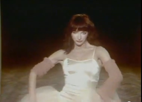 Ah yes. That's all I need! A little Kate magic/medicine.  --Paul-- |
|
|
|
Post by gothicaljordan on Jul 17, 2010 20:35:14 GMT
Agreed. Especially since the uncropped version of this picture has Bertie on the other side. Mother and son.
Ah, I shall go watch the video right now to see if I can spot the look you're referring to.
|
|
|
|
Post by gothicaljordan on Jul 17, 2010 20:38:55 GMT
Yep, just watched it. I see the look you're referring to, and I like it  I don't know what it is, there's just something about that look... |
|